THE FINE ARTS DIGITAL PRINTING TECHNOLOGIES OF TODAY


Since the mid-90’s, I have been printing my digital drawings, illustrations and retouched photos created using illustration and image processing software such as Corel Painter and Adobe Photoshop.
THE BEGINNINGS WITH IRIS GRAPHICS
Iris was one of the first printing technologies developed in the mid-1980’s as a proof printer for the printing industry.
It was until the late 80’s that this printing technology began to interest visual artists and photographers. The price of such a printer was over $ 100,000. Known as "giclé" a term, created in 1990, was referred to in the name of the printing technique of a digital artworks, having a more high end impact than the term "inkjet".
It was recognized by professionals in photography and publishing. Its default... if we loose a drop of water on the printed image with Iris technology was seeing its colors dilute, making our print good for the trash.
A NEW PLAYER CALLED EPSON
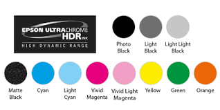
In 2000, Epson developed state-of-the-art inkjet technology for color and detail reproduction.
Not less than 8 to 10 colors and shades of gray are used to increase the range of printable colors compared to the traditional 4-color process used in commercial printing.
Printed art are then called "digital prints", a nomenclature taken up by galleries and fine arts museums. Printers were sold at a much more affordable price.

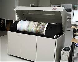
A CERTIFIED PRINTING STUDIO IN MONTREAL
The Epson printing technology offered by Photo Service Montreal is the one I use since 2004.
Today, this laboratory uses Hahnemüehle paper, a famous German brand. Photo Service is a studio certified by Hahnemüehle, which guarantees a quality of work that lives up to expectations.
For more information about Hahnemüehle paper, the link is:
https://www.hahnemuehle.com/fr/digital-fineart.html
ANOTHER COMPETITOR CALLED CANON
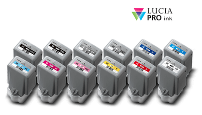
Canon offers similar technology, and I use it for my 12x18-inch limited edition prints with the exception that the paper is slightly thinner.
The printing studio is located in Laval, which is convenient for me, residing in that city!
The paper used is Canon's "Photo Satin 240 GSM" on which Canon Pro's "Lucia Pro" pigment inks are used, offering a good color palette with 12 colors, as shown in the picture on the right.
MORE INTENSE COLORS
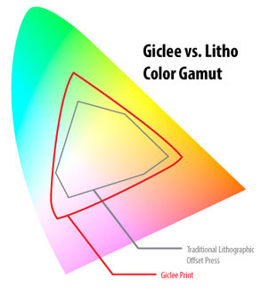
With current printing technologies ranging from 6 to 12 colors, the printable color field has greatly expanded, allowing more saturated hues to be reproduced.
The illustration on the left shows the difference between traditional 4-color process printing and the possible colors to be printed with the use of the giclé printing technology. It can be seen that more pale and saturated colors can be reproduced.
DIGIGRAPHY, WHAT IS IT?
In 2003, Epson France developed a technologically advanced concept called "digigraphy". The whole thing is to produce digital prints in a kind of laboratory with a controlled environment to standardize colors according to the frequency of printing of the creator.
A very detailed certificate of authenticity on printing technologies such as the machine and the inks used is mentioned there, including the name of the operator of the printing machine.
To learn more about digigraphy, the link is: http://www.digigraphie.com/int/la-digigraphie-expliquee/index.htm
MULTIPLE PRINTED SUPPORTS
Print media are becoming more and more varied, ranging from watercolor paper to artist's canvas, to aluminum or wood panels. For my part, I use a semi-gloss paper, which has the quality to make the colors dark, even darker.
Being semi-glossy, there are no unpleasant reflections caused by ambient lights as is the case for glossy paper, which is very reflective. I did some printing on canvas, and the addition of a semi-gloss varnish helps a lot to enhance the overall look that without it offers a very matte finish.
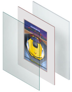
THE FRAMING USED
The framing of high-end digital prints requires a framework that will ensure long-term preservation. The materials used must be anti-yellowing or often called "acid-free" in the world of art galleries.
A simple mat is recommended to prevent the printed image from being in contact with the glass. Having a double mat makes it possible to add a little fancy, especially if one chooses a coloured cardboard to be placed under the one which is often white, or a pale color.
Several types of protective glass are also available on the market, either UV-resistant and non-reflective glass, often used in fine art museums, which is 3 to 5 times more expensive than regular protection glass.
THE SUPPORTS I USE
Although comfortable with my choice of semi-gloss papers on which I print my automotive portraits, I plan to produce prints on watercolor paper to offer a product "Premium" to car owners who want to have a more distinctive product.
In 2018, I had some canvas prints done. Considering the matte finish, I have to apply up to 3 coats of semi-gloss varnish so that the colors are more interesting to look at, especially involving the dark colors.