
FOR GENERAL INFOS, CALL +1 514 528 8908
EMAIL ME AT: [email protected]
THE ART OF FRAIMING
Get some ideas on how to frame professionally your Lemireart's printed drawing
n artwork hanging on your home wall is always more interesting to look at when it's well framed with simple or double mats.
Several options are possible depending on the tones of the image and your office, video game room, man cave or garage wall color to decorate.
You'll see some examples of framing color combo in this detailed article.
On a personalized Lemireart printed drawings, the mat is "the choice of choice" to bring out the image on the wall. A width of 2 inches is suggested for the mat around the image to frame.
SOME TIPS
A museum quality glass with UV protection, lower reflection and dry mounted on acid free cardboard is suggested for a longer conservation of your printed drawing.
If the image is in light color shades, a white mat may pass, but not on a dark image. The whiteness of the mat may extinguish the color of a dark work.


The use of a mat that use color in the artwork is a good solution to this problem. A second colored mat can be added under the visible mat for more high class looking!
A CLASSIC VISION
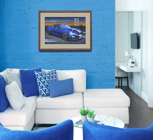
Taking a more classic touch is another avenue in framing. A wooden frame dyed in a dark color, which could harmonize well with your wooden floor, like on the intro picture at the top of this page. Add a beige double mat on top and white underneath that can be coordinated with lots of wall colors.
See for yourself this little animation!

THE COLOR WHEEL AS A WORKING TOOL

To help you make a wise and visually interesting choice, we will use the color wheel. Well known to creative people, the color wheel was created by the British scientist, Isaac Newton in the 17th century.
He studied the transformation of white light into a rainbow. He separates the colors into seven groups.
To learn more about the chromatic circle, visit this link:
https://en.wikipedia.org/wiki/Color_wheel
PLAY WITH COLORS
To harmonize a frame with the color of a wall, it would have to go with a complementary color. This is a color that faces another on the color circle, as represented using the 2 small pale circles. For example, a sky blue pulling a tad on the navy blue, would see its complementary color be an orange.


Having a frame with an orange mat on a wall of such blue would see this mat come out strongly. As for the opposite, to have a
blue mat on an orange wall, the mat would have a less intense effect.
NEUTRALITY IN CASE OF A CONFLICT WITH YOUR LOVE ONE
To attract less eye colors around the frame, the ideal is to go with colors more neutral as a bluish gray, also called cold gray, in reference to the cold colors that are blue, green and violet. A silver molding makes it possible to well distinguish and separates the interior of the frame to the wall.

As you can see, framing a decorative image can be a good puzzle, especially if the choice of colors of the frame setup are done with your loved one!
SOME OTHER TIPS
Before hanging your framed Lemireart piece of art on your wall, be sure to find a wall spot the sunlight don't come on it during
the year.
And you, how would your next purchase on Lemireart.com would be framed?
Drop a line to let me know!


